Unlocking Insights: TheseusPlot 0.3.0 Enhances Rate Metrics Visualization
TheseusPlot is an R package designed for dissecting and visualizing differences in rate metrics between two groups. The latest release, version 0.3.0, enhances this capability by improving clarity and usability, allowing analysts to gain deeper insights into how specific subgroups contribute to overall performance metrics. As businesses increasingly rely on data to guide their decisions, tools like TheseusPlot become vital in parsing complex information into actionable insights.
Understanding the Need for TheseusPlot
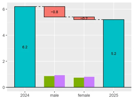
In an age of data-driven decisions, grasping the nuances of analytics is more pressing than ever. Consider the example of analyzing click-through rates across different demographic groups. If you've ever looked at data trends over time, you know how deceptively simple numbers can lead to complex interpretations. TheseusPlot dives deep into those figures, revealing the underlying mechanics of how different segments of your audience behave over time. Rather than simply providing a broad overview, it offers a microscopic view of the factors driving change.
Imagine analyzing how click-through rates vary over two periods: 6.2% in 2024 versus 5.2% in 2025. The Theseus Plot helps reveal which demographic—like male or female users—most impacted that 1.0 percentage point drop. It's that granular approach which can assist businesses in pinpointing areas for improvement and potential growth opportunities. For companies, identifying the specific demographics contributing to underperformance is invaluable. Resources can then be focused on increased outreach and marketing strategies tailored for those segments.
Enhancements in 0.3.0
Improved Plot Cleanliness
One of the welcome changes in version 0.3.0 is the removal of automatic column names as subtitles in plots. This adjustment simplifies the visual output considerably. It enables users to integrate the plots into reports or presentations where context has already been introduced. A cleaner look also enhances communication with stakeholders who may not be familiar with data jargon.
Users can specify a custom x-axis label using the new xlab argument in the create_ship() function. They can tailor the output in a way that resonates best with their audience. For instance:
ship <- create_ship(
data_2024,
data_2025,
y = clicked,
labels = c("2024", "2025"),
xlab = "Gender",
ylab = "CTR (%)"
)
ship$plot(gender)
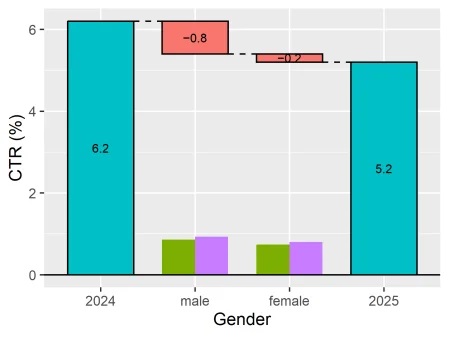
This distinction is indispensable when presenting technical data that needs to be digestible for varied audiences. It’s about making data both accessible and appealing.
Enhanced Default Labels
The default labels for groups have shifted from "Original" and "Refitted" to "Baseline" and "Comparison". These new terms better align with common analytical frameworks and offer clarity. When you're diving into metrics for a year-over-year comparison—or contrasting control versus treatment groups—context matters. This change simplifies interpretability.
User-defined labels remain an avenue for customization, ensuring that no one is boxed into generic terminology:
ship <- create_ship(
data_Nov,
data_Dec,
y = on_time,
labels = c("November", "December")
)
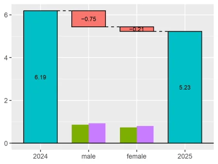
Simpler Numeric Display
The default display of decimal places has been streamlined from three to one. This change addresses feedback that excessive precision can often cloud the visual message, detracting from the quick insights that visuals should convey. If you're dealing with technical decisions, you'll appreciate the lightweight format that still allows for precision adjustments through the digits argument.
ship <- create_ship(
data_2024,
data_2025,
y = clicked,
labels = c("2024", "2025"),
digits = 2
)
ship$plot(gender)
Plot Refinements and Fixes
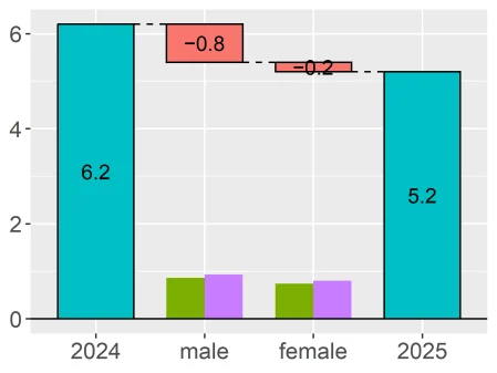
Version 0.3.0 addresses key rendering issues in plots. The inclusion of subgroup size bars is now consistent, offering clearer visibility into sample sizes across groups. This clarity is critical, especially when analyzing data from varying sample sizes. Improved scaling ensures the heights of subgroup size bars are calculated from a consistent maximum plot score, enhancing comparability regardless of layout. Think about what this means for interpretation—accurate scaling leads to better visual comparisons.
Additionally, text size adjustments respond more predictably to user-defined ggplot2 themes. It’s a small yet significant factor that helps ensure customizations appear as intended. A visually appealing plot often enhances audience engagement.
ship <- create_ship(
data_2024,
data_2025,
y = clicked,
labels = c("2024", "2025"),
text_size = 1.5
)
ship$plot(gender)
Installation Guide
Installing TheseusPlot is a straightforward process. This simplicity is part of its appeal, especially for analysts who may not be familiar with complex installations. It can be done from CRAN with one command:
install.packages("TheseusPlot")
Explore the Functionality
TheseusPlot shines in scenarios where understanding variations in rate metrics is essential. Key applications include:
- Click-through rates
- Conversion rates
- Retention rates
- Success rates
- Error rates
Each application serves a distinct purpose, enabling you to dig into the data that drives your business. When you understand these nuances, you’ll likely see different ways to strengthen strategies across various metrics.
To access further details, visit the package website:
Implications and Future Outlook
The release of version 0.3.0 carries implications that extend beyond usability enhancements. In a sector where data interpretation can make or break strategies, tools that empower users to see the bigger picture are essential. Companies that adopt TheseusPlot will likely find themselves better equipped for competitive analysis. The shift to clearer labeling and improved visual outputs doesn't just benefit analysts—it also aids in stakeholder communications. That’s vital in a landscape of increasing data scrutiny.
As data continues to grow in importance, the enhancements in TheseusPlot signal a commitment to continuous improvement. If you're working in this space, watch closely for future updates that could further refine analytics capabilities. Analytics aren't just about numbers; they're about the stories those numbers tell, and TheseusPlot is shaping how those narratives are crafted.