Visual Design Trends in Google Apps
Google's recent redesign of its Magnifier app fits into a broader trend where tech giants like Google prioritize aesthetic consistency across their application suite. By standardizing design elements—think bright gradients and minimalist icons—companies can create a more cohesive user experience. This isn't just for visual appeal; it reflects a strategic approach to brand identity. Users should immediately recognize an app as part of the Google ecosystem, forming a psychological connection that reinforces loyalty.
While many praise these visual updates, the underlying technical challenges must also be acknowledged. A fresh design can often come with unforeseen complications. It seems Google, amid its ambitious overhaul involving a shift toward more flamboyant colors and gradients, may have overlooked the importance of functionality in the process. This tendency to prioritize style over substance isn't new. Apple has faced similar scrutiny in the past when aesthetic changes have compromised user functionality.
The Significance of Icon Functionality
The issues stemming from the new icon design in the Magnifier app can't be downplayed. Users expect a seamless experience, especially from first-party applications. When the redesign leads to a blank colored circle instead of the intended icon, it raises questions about Google's quality control processes. Users are understandably frustrated; they download the app to enhance their daily tasks, and disruptive glitches undermine that utility.
This isn't an isolated incident. Various previous updates to Google’s apps have seen mixed receptions. Issues like app icons not displaying correctly aren’t just aesthetic failures—they can affect how users interact with the app as a whole. If you're working in this space, the importance of a stable, well-functioning user interface is self-evident. This particular glitch pulls focus away from the actual purpose of an application designed to help users magnify objects and text, leaving them with an ineffectively labeled app.
Another critical aspect is feedback loops during the redesign process. Tech companies often rely on user testing to gather insights before rolling out significant updates. The fact that such a glaring issue slipped through the cracks suggests either rushed development cycles or inadequate beta testing phases prior to the release.
Design Features of the Updated App
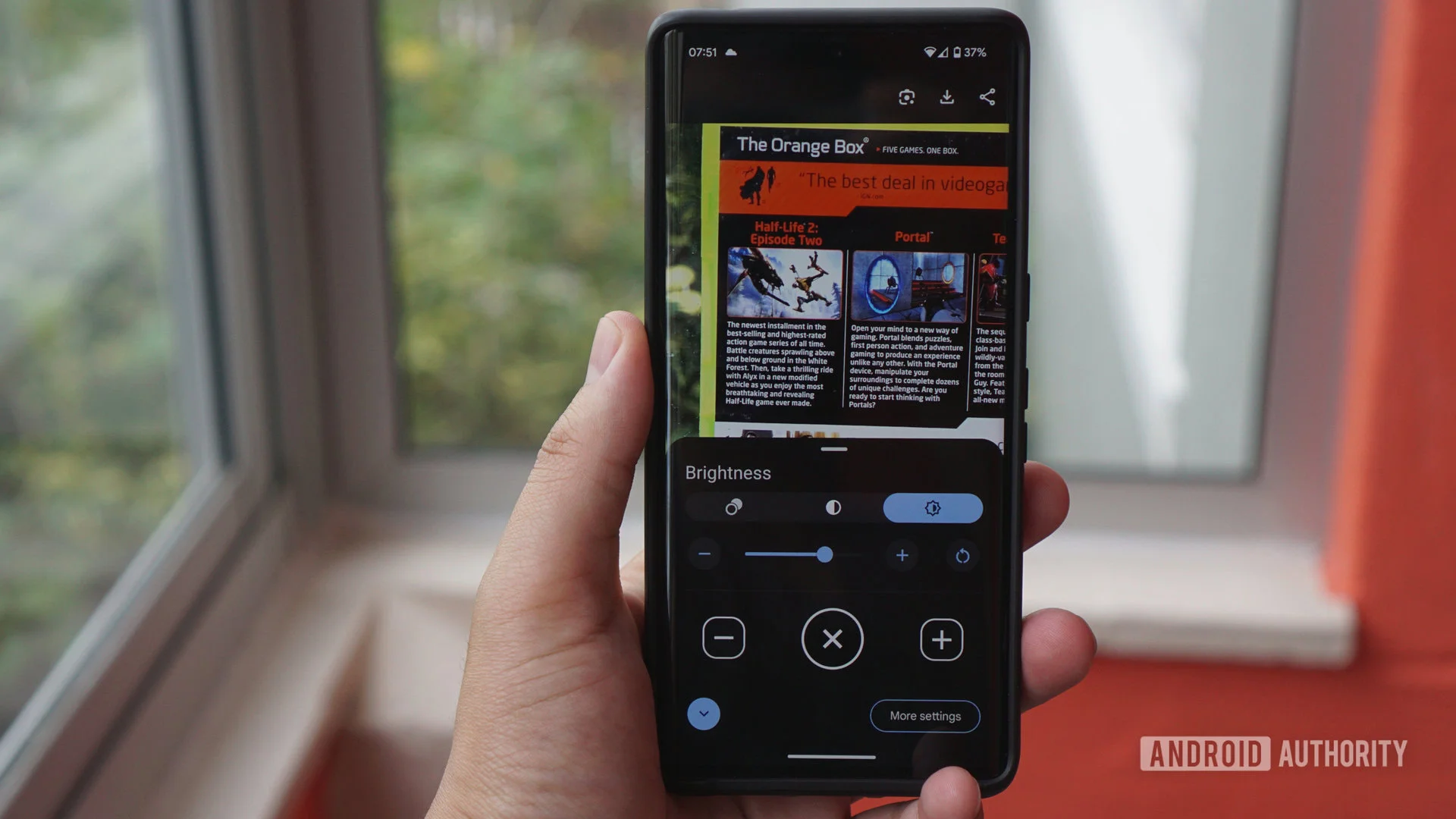
Examining the redesign, version 2.0.0.965719431 showcases a more vivid aesthetic. The app’s new icon features a gradient blend that moves from blue to purple. This shift not only modernizes the app’s look but signals a deliberate move away from its more subdued predecessors. The thicker magnifying glass serves as the centerpiece, emphasizing the app's core function. A visual comparison reveals stark distinctions, making it apparent that the design team aimed for a striking transformation.
That said, though the gradient design may appeal to a younger demographic, it's unclear how well this resonates with users looking for a tool that highlights practicality. Given the functionality's primary goal, a more subdued design could've been beneficial. This is more significant than it looks; when users prioritize a tool for its utility, their attachment to or preference for a visually striking design might be secondary.
In similar cases, revised visual aesthetics have met backlash when they overshadowed functionality. Users of apps with simplified interfaces often express a desire for versatility, which includes retaining familiarity in design. This situation serves as a cautionary tale for designers; constant evolution is essential, but it should never come at the expense of reliability.
Broader Implications for Google and the Tech Industry
The malfunctioning icon issue shouldn't be viewed merely as a blip in Google's development timeline; it reflects larger industry trends. Design and function aren’t always equal partners in product development, and this gap can have implications for user trust and engagement. If Google cannot manage the balance between fresh design and functional integrity, users might begin to question the reliability of its ecosystem.
It's worth considering the impact on brand perception. When a critical service like the Magnifier app falters due to design missteps, it chips away at the confidence that users have in Google's products. There’s a psychological contract that users form with brands; they expect not just performance but pleasure from their interactions.
As tech companies increasingly rely on designs that resonate with aesthetic trends, the risks associated with overlooking user experience will likely continue to surface. It places an onus on product teams to focus on user feedback and iterative testing. If this vigilant approach isn't adopted, the tech industry may well face a scenario where aesthetic concerns consistently overshadow core functionalities, leading to diminished user satisfaction.
Future Outlook: Retrofitting vs. Proactive Design
The future might necessitate a shift toward more thorough pre-launch testing and an integration of user feedback loops that can mitigate such challenges before launch. Google's Magnifier update represents a microcosm of what we could witness more broadly in the industry. Efficiency might start to share the podium with aesthetics in development agendas. Companies that successfully embrace this balance—implementing both proactive design and rigorous testing—are likely to come out on top.
As app users become more vocal about their preferences and experiences, tech firms have to adapt. They won't just care about how visually appealing apps are; the demand for efficiency and usability will surpass the allure of pretty icons. If Google's still working through its issues, this could serve as a pivotal lesson for the tech community to observe.
Undoubtedly, brands must maintain allure without compromising on functionality. If not, they'll discover a loyal user base can quickly become a faded memory.